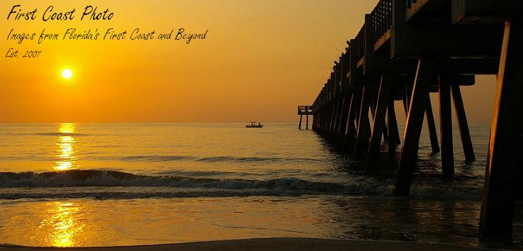
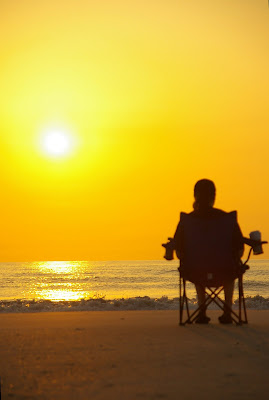
 This week we have a Sky Watch photo of someone watching the sky! My lovely wife in the chair, enjoying the beautiful sunrise over Atlantic Beach, Florida earlier this month.
Due to the narrower focus of the portait shot the shot loses some of the depth of orange color compared to the landscape image, but I prefer the composition of the portrait. Oh well, we can't win all the time, can we? :)
Visit the Sky Watch blog for links to all the other blogs, where I am sure you will find more than just another day at the beach.


19 comments:
Wonderful sun!
Two greats shots!
Luiz
These are fabulous shots Alan! Looks like she's the only one out there. So peaceful...
Beautiful post!
Sun is always marvelous!
Happy weekend!
Luiz
Happy SWF..I love these photos, especially the colors..Have a great weekend..we are almost there..
I preferred the first one. It had more space.
definitely a postcard moment.
it warmed me-up in this rainy day. have a nice day alan.
simple beautiful!
simple beautiful!
Wow! my favorite color. Great catch for SWF!! Mine's up too hope you can drop by. Happy weekend
Absoloutely stunning.
Looks like you had a front-row seat!
It is all a matter of taste and preferences. They are both good compositions, but the landscape gave me more a feeling of peace and quiet; the other was more intense to me.
What a nice shots! Mine is up as well. Hope to see you there! Have a great weekend!
Cheers,
http://www.nitascorner.info
http://www.nitasrandomthoughts.info
http://www.downeastartscenter.org
http://www.thomastraveltales.com
http://www.thomasweblinks.us
great pics have nice weekend
Great picture. Love the silhouette of E. Really lovely.
Hi Alan
These really are nice, the colours is exquisite...
Forgive this part of my comment as this is done by Copy & Paste.. but with over 300 to visit and check I am sure you will understand...
May I thank you on behalf of the Sky Watch team for your post this week and for helping to make Sky Watch special.
Tom :O)
A big WOW!
Beautiful capture of the SuN & SkY!
Great sky~watch image!
Have a beautiful week!
And Happy sky~watching!
I agree with Rune "It is all a matter of taste and preferences."
It is not that easy to add something special by the way to a landsacpe/sky watch photo. The first one is perfect, the dark silhoutte is just there, not dominating and not in the center.
Good job ****
Post a Comment